The problem
An art storefront has to communicate enough product information to support a purchase without making the interface louder than the work itself.
Case study · Art storefront
A quiet, editorial storefront that lets the artwork carry the interface.
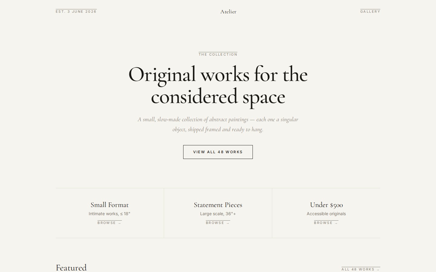
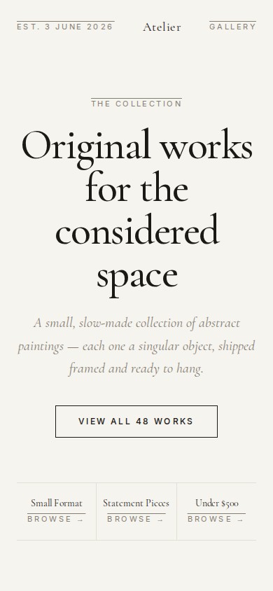
An art storefront has to communicate enough product information to support a purchase without making the interface louder than the work itself.
cranberriestudios built an editorial collection experience with strong typographic hierarchy, collection-based discovery, large imagery, and intentionally restrained purchase controls.
The live design can present dozens of works while individual artwork pages still feel closer to a gallery placard than a crowded commodity product page.
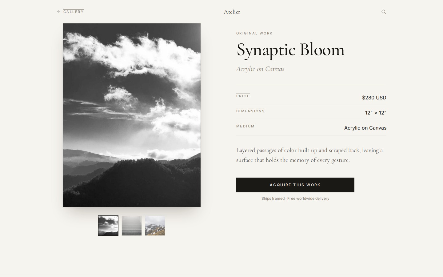
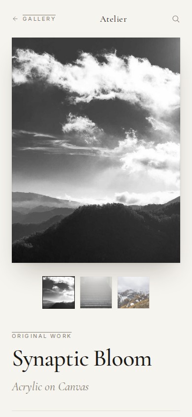
Facts visible in the current live storefront.
48
Works in the live collection
The current live gallery presents a 48-work collection from the primary collection entry point.
3
Browse lanes
Small Format, Statement Pieces, and Under $500 provide immediate collection entry points.
3
Artwork gallery views
The captured Synaptic Bloom detail page presents three selectable visual views beneath the primary artwork.
2
Responsive captures
Every case-study view is verified against both desktop and mobile presentations of the live site.
01
The homepage treats the catalog like a gallery first, using restrained typography, generous whitespace, and a clear route into the full collection.
02
Visitors can enter the collection by scale or budget rather than being forced into a generic product grid immediately.
03
Large imagery leads the product view while title, medium, dimensions, price, description, and supporting gallery images stay secondary but accessible.
04
Each artwork detail keeps the purchase action visually distinct without surrounding the art with excessive commerce chrome.
05
Desktop uses a two-column artwork/detail composition while mobile linearizes the same content without losing the gallery hierarchy.
06
Large art panels, framed whitespace, and restrained UI give the imagery room to carry the page rather than competing with it.
The project uses a static-first Astro frontend and keeps the visual system intentionally small: strong typography, simple navigation, large image surfaces, and responsive compositions.
We can build commerce presentation around the character of the product instead of forcing every catalog into the same store layout.